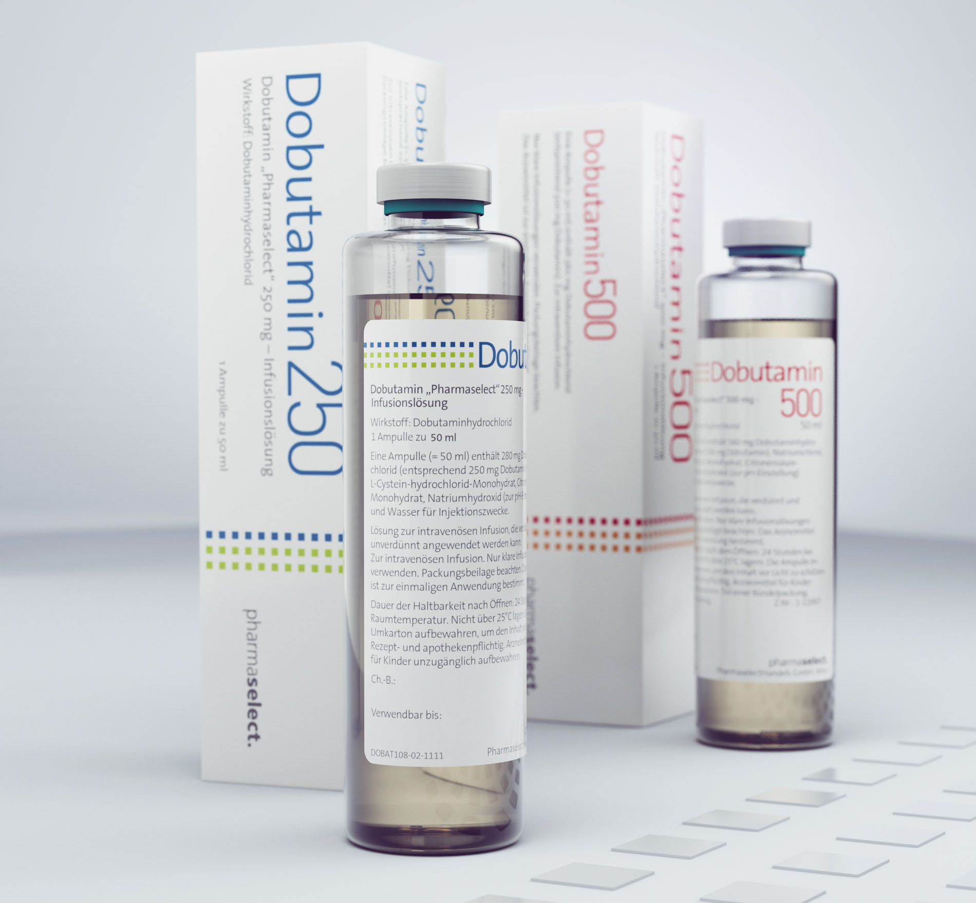
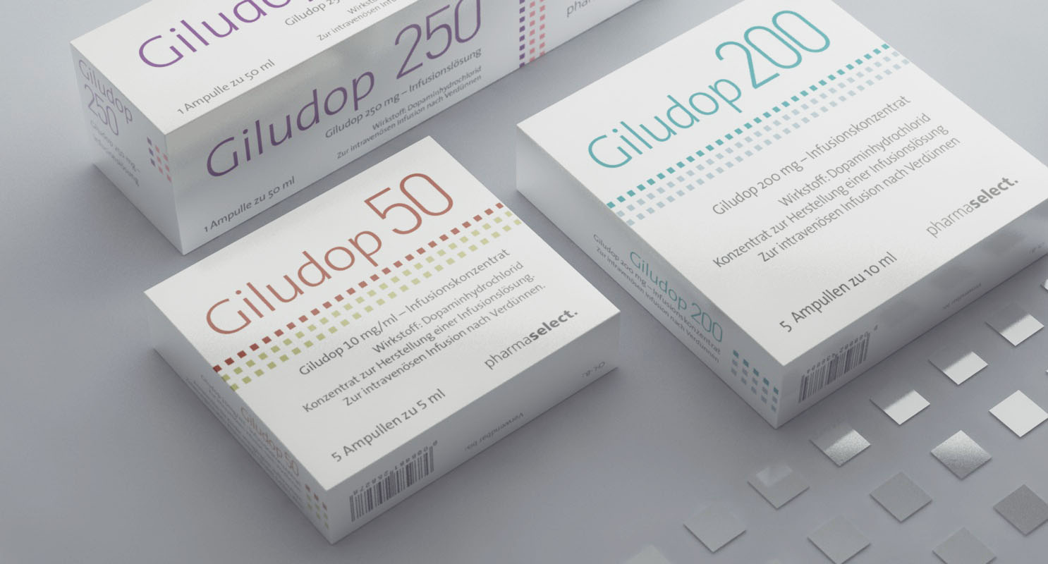
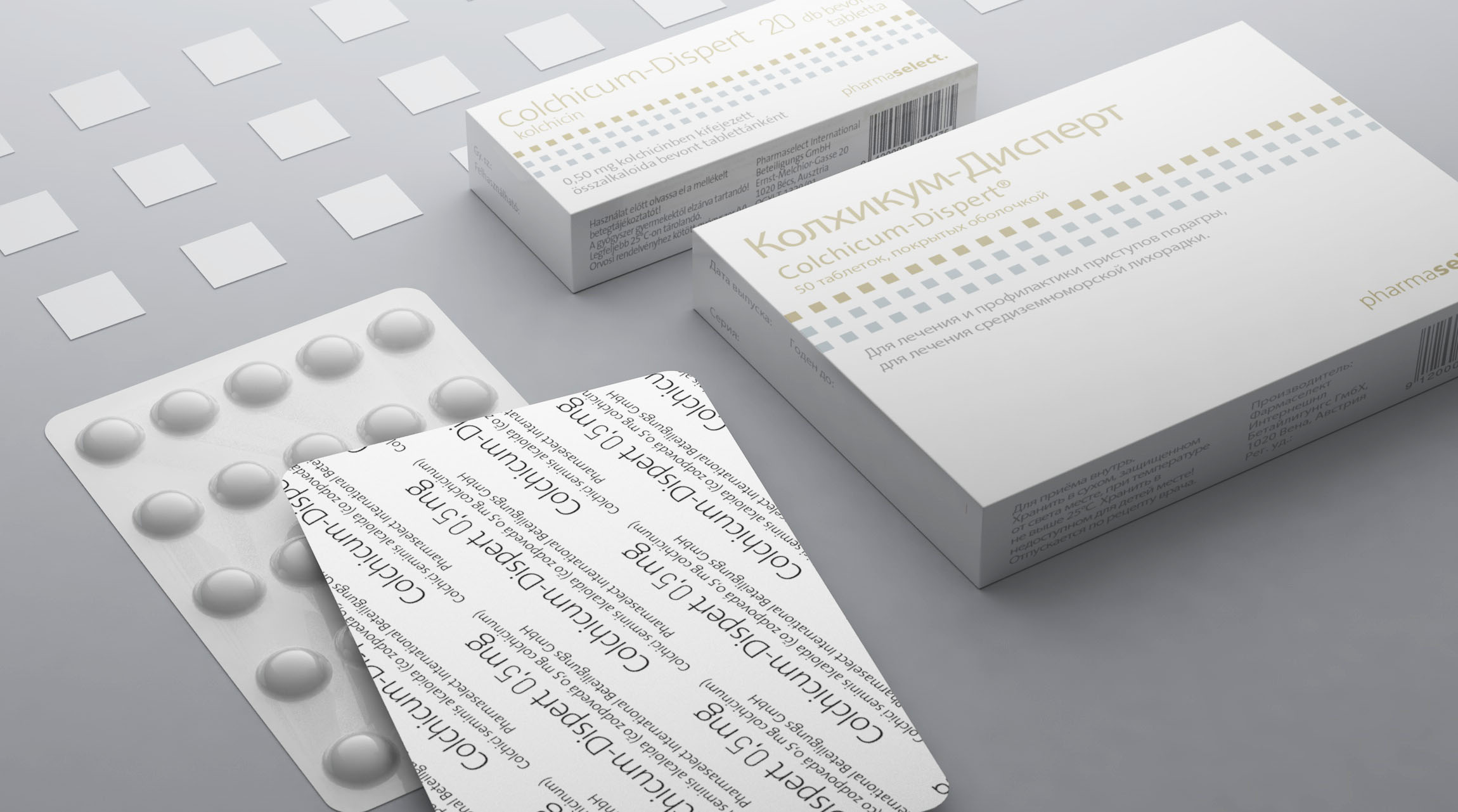
For a new line of prescription-only products, the client needed a unified style to connect the products and make them look slick and clean.
Important aspect of the new design was a color-coding system that made a clear distinction between various active ingredients and the dosage. The products were mainly used in hospitals, an environment where stress can be a factor. So displaying the color-coded differences among the strengths of active ingredients was crucial.


