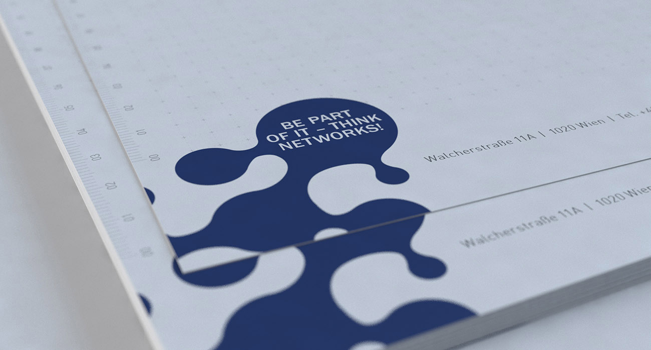
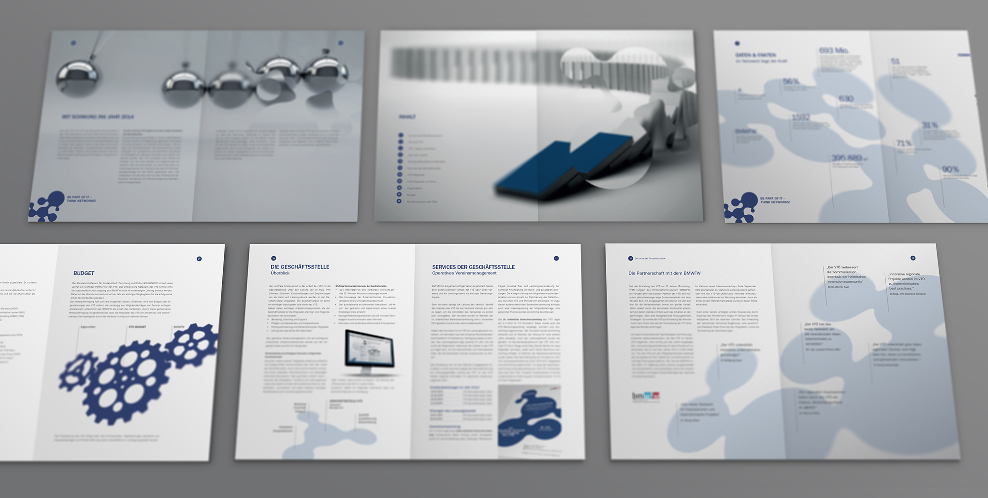
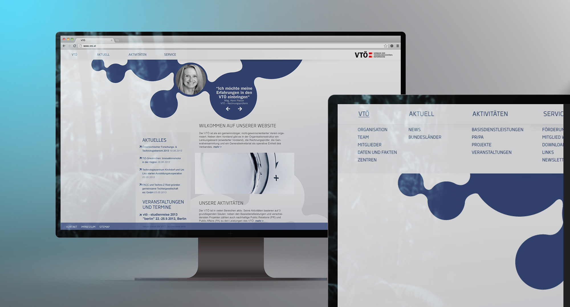
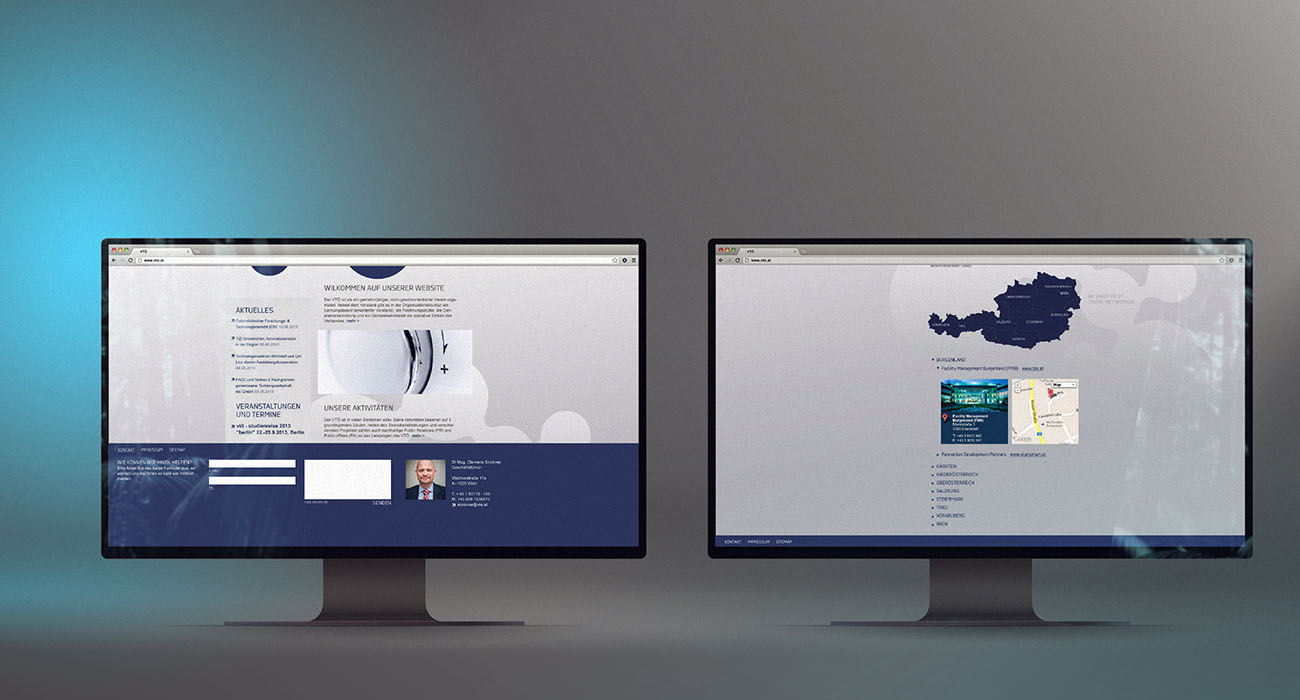
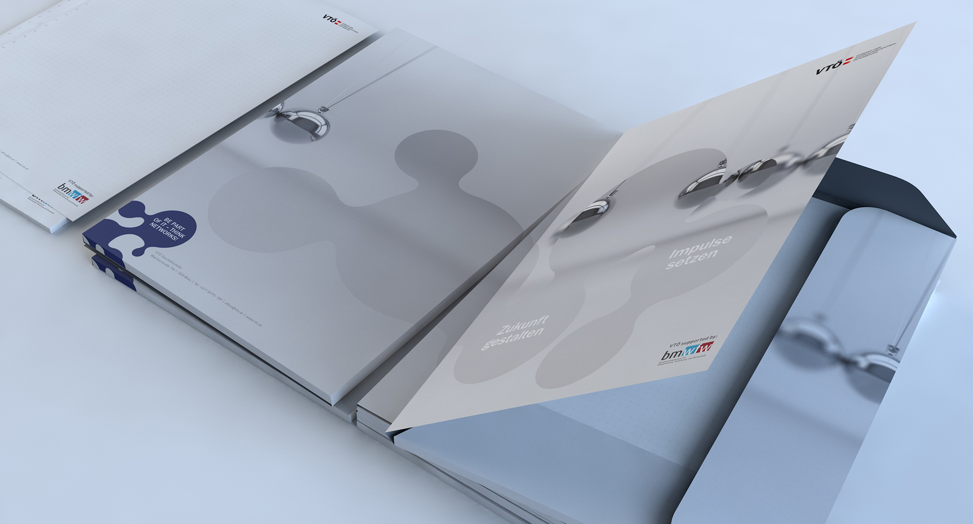
When I came to this project, the blue blobs were already established as a key design element. I first made some tweaks to the shape, since it was not made of circles but rather, well, blobs. The client was an association representing technology centers, and their activities were all about connecting technology R&D companies. The members are visionary startups and development facilities. VTO is funded by the Austrian government, so my work had to carry a formal feeling as well. It was important to convey the fact that their main priority is their work as an association, not as a technology company.
- branding
- corporate design
- web design
